Daniela Litman
I like the concept of the website, it is simple and clean. It also looks professional. She does not put so much of her stuff in the website, there is cookbook, technical drawings, illustration, moldboard and jewelry. It is easy to navigate, for example if we want to look for her work, about her and how to contact her, we can find it on the top right. She does not put so much information about her, there is no resume but she put the skills that she offered and also how to contact her.
Ashleigh Downer
The name of the website is I'm Tawn. I am pretty like the concept of this website. It is kind of have a dark feeling but still colorful. The website is also show the reflection of the designer because it matches with the collection. The website itself is so easy to navigate, all the control buttons are on the top right corner. I also like that he put his logo on the top left. He put a little bit story about himself and he put his CV and we can also download his cookbook and contact him.
Daniel Ressa
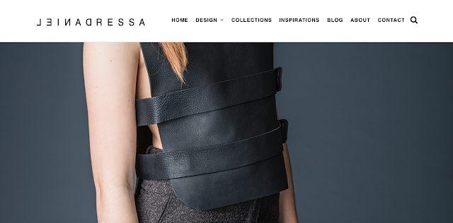
I like the simplicity of this website, but still looking professional. The website itself is easy to navigate, everything that we want to know are on the top right corner and he has this logo on the top left. He put his inspiration and about him on the website. He also put how to contact him. He didn't put his resume, but he put his achievement until this point in the website


0 comments:
Post a Comment